In my first scene at the "bar" I thought about using the classic close-up shot of the man holding a cigarette, tapping the ash into the ash tray. I wouldn't put too much emphasis on this though as I dont want to lose the elegance of film noir.
I found this image when I typed 'stubbing a cigarette out' into google images, but I wouldn't use it in my film noir as it looks like it fits in more with the western genre what with the costume and how the man is choosing to put out the cigarette.
I like this photo because you can see the trail of smoke, it makes the photo look delicate and the way the hand looks as though its about to tap the ash off fits in with how I want it, but I don't like how its so there in your face as the other photo in black and white is more abstract and you realy have to concentrate on what it is to reveal it.
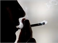
 I like how this photo of a man (or is it a man?) and cigarette is silhouetted, this fits in with the stereotypical mysterious of the film noir genre. I think its a very well took photo, working well with the rule of thirds.
 In the photo on the left the attention is far too much on the cigarette with the background and person being blurred with the small depth of field, it looks too youthful and I want it to be all about the character, with the cigarette being but a prop that only eccentuates the tough character of Jack like in the photo on the right.


Its a good idea to show different examples of how somebody can hold a cigarette, and how that can show what type of person they are. I really like it!
ReplyDelete